Everything You Want To Know About Media Queries and Responsive Design
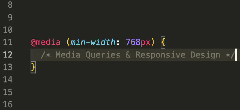
Table of Contents
What is a Media Query?
Media queries are a CSS language feature which allow an author to conditionally apply CSS rules according to characteristics of the device or window in which an application is being viewed. Most commonly, these might be according to the viewport width allowing CSS authors to create components and layouts that are responsive to the size of the window or device that they are being viewed in. But this may also extend to whether a user prefers light or dark mode, or even a user’s accessibility preferences, plus many more properties.
What is Responsive Design?
With the rise of so many different device types and screen sizes, it has become increasingly important for web applications to provide a more tailored visual presentation to users, optimised for the screen size of their preferred interaction methods.
Responsive design can be accomplished through a combination of techniques including conditionally applying CSS rules with media queries, container queries, and choosing layouts which are flexible according to the content that they hold (such as flexbox or grid). We’re going to focus on media queries and responsive layouts in this article, but container queries are something to keep in mind too as the long tail of browser support increases. As of writing, they’re not yet ready for prime-time, but can be used for progressive enhancement.
What is Mobile-First Design?
Mobile-first design is a principle which may be employed when designing and building responsive web applications. Ideally, this approach should be used as a guiding principle at all stages of the process - from beginning to end. For design, this means that the first iteration of a wireframe or UI design should focus on the mobile experience before moving on to wider viewport sizes.
Although you could approach web applications from the other direction (wide-first), it is a much easier process to reorganise components visually as more screen real estate becomes available than it is to try cramming components into a smaller screen space.
A similar rule applies to the development process too. In general, you should write markup and styling for the base-case (narrowest screens) and, where necessary, progressively apply conditional styles for wider screens.
Whilst you could approach this from the other direction, or use a mixture of narrow-first and wide-first approaches, this can make your styling more difficult to comprehend and increases the mental load for others when reviewing or maintaining. Of course, there are exceptions where writing a small number of wide-first rules is simpler, so use your discretion.
CSS Pixels vs. Device Pixels
When Apple launched the iPhone 4 in 2011, it was the first major smartphone to employ a high density display. Earlier iPhones had a display resolution of 320x480px, and when the iPhone was introduced with its so-called “Retina Display” — doubling the resolution to 640x960px with the same physical display width — it presented a challenge. Not wanting users to be confronted with a situation where they constantly ask themselves, “What is this, a website for ants?”, an ingenious solution was devised whereby the iPhone 4 would follow CSS rules as if it was still a 320x480px device, and simply render at double the density. This allowed existing websites to function as-intended without requiring any code changes - a common theme you will find when new technologies are introduced for the web.
From this, the terms CSS pixels and device pixels were created.
The W3C CSS specification defines device pixels as:
A device pixel is the smallest unit of area on the device output capable of displaying its full range of colors.
CSS pixels (also known as logical pixels or reference pixels) are defined by the W3C CSS specification as:
The reference pixel is the visual angle of one pixel on a device with a device pixel density of 96dpi and a distance from the reader of an arm’s length. For a nominal arm’s length of 28 inches, the visual angle is therefore about 0.0213 degrees. For reading at arm’s length, 1px thus corresponds to about 0.26 mm (1/96 inch).
The 96 DPI rule for a reference pixel is not always strictly adhered to, and may vary depending on device type and typical viewing distance.
The device pixel ratio (or dppx) is the one-dimensional factor for how many device pixels are used per CSS pixel. Device pixel ratios are generally integers (e.g. 1, 2, 3) as this makes scaling simpler, but not always (e.g. 1.25, 1.5, etc.).
How Do I Make My Site Responsive?
By default, mobile browsers will assume that a website has not been designed to accomomdate the narrower viewport of such a device. For backwards compatibility, these browsers may render a site as if the screen were larger and then downscale to fit in the smaller screen. This is not an ideal experience, with a user frequently needing to zoom and pan around a page, but allows the site to function mostly as it was originally created.
To tell the browser that a site is providing an optimised experience for all viewport sizes, you can include the following meta tag in the document <head>:
<meta name="viewport" content="width=device-width, initial-scale=1" />
Non-Rectangular Displays
Some devices nowadays have rounded corners or display occlusions (such as a display notch, camera holepunch, or software overlays) which mean that the entire rectangle is not “safe” to utilise for content as it may be partially or wholly obscured.
By default, browsers on such devices will display content within a “safe” inscribed rectangle and vertical or horizontal bars matching the document background.
There are ways to allow content to extend into this area and avoid the ugliness of letterboxing and pillarboxing, but this is a more advanced feature that isn’t required.
To opt out of the default letterboxing and pillarboxing and declare that your application can appropriately deal with safe and unsafe areas of the screen, you may include the following meta tag instead:
<meta name="viewport" content="width=device-width, initial-scale=1, viewport-fit=cover" />
Text Sizing
Mobile browsers may also artificially inflate font sizes to make text more readable. If your site already provides appropriately sized text, you can include the following CSS to disable this behaviour:
html {
  -moz-text-size-adjust: none;
  -webkit-text-size-adjust: none;
  text-size-adjust: none;
}
Whilst there is no mandated minimum size for text in accessibility standards, 16px is a good minimum for most circumstances.
For input fields, browsers may zoom in when focusing if the font-size is less than 16px. There are methods to disable this behaviour, such as setting a maximum-scale=1.0 in the meta viewport declaration, but this is strongly advised against as this may interfere with users who rely on zooming. A better solution is just to make sure that the font-size is at least 16px.
What are Breakpoints?
A breakpoint in styling refers to a point at which conditional style rules stop or start applying to the page in response to viewport size. Most commonly, this will refer to a min-width or max-width, but can also apply to height too.
In media queries, these breakpoints (768px, 479px) will be used something like this:
@media (min-width: 768px) {
  // Conditional styles here for width >= 768px
}

@media (max-width: 479px) {
  // Conditional styles here for width <= 479px
}
When following the principle of mobile-first design, most of the time min-width media queries should be used.
It is also important to note that min-* and max-* queries apply to an inclusive range, so when defining styles either side of a breakpoint, you should not use the same pixel value.
It is also important to note that when zooming in on a page, the viewport size in CSS pixels may change along with the apparent device pixel ratio. This can lead to scenarios where a viewport may actually behave as if its lengths are fractional values.
@media (max-width: 479px) {
  // Conditional styles here for width <= 479px
}

@media (min-width: 480px) {
  // Conditional styles here for width >= 480px
}
In the example above, if the viewport were (as a result of zooming) to report as 479.5px, neither of the conditional rule blocks would apply. Instead, an extra fractional value of 0.98px is usually applied to the max-width query, e.g.
@media (max-width: 479.98px) {
  // Conditional styles here for width < 480px
}

@media (min-width: 480px) {
  // Conditional styles here for width >= 480px
}
Why 0.98px specifically? 0.02px is the smallest division of a CSS pixel that an earlier version of Safari supported. See WebKit bug #178261.
CSS has introduced in the Media Queries Level 4 spec the concept of a range query, where the operators <, >, <=, and >= may be used for more expressive conditions, including both inclusive and exclusive ranges. As of writing these are now supported in all major evergreen browsers, however, the long tail for support on platforms like iOS is not yet sufficient.
@media (width < 480px) {
  // Conditional styles here for width < 480px
}

@media (width >= 480px) {
  // Conditional styles here for width >= 480px
}
What Breakpoints Should I Pick?
This is a question that gets asked fairly frequently, but to be frank it does not matter too much these days as long as a web application works reasonably for all screen sizes in between your chosen breakpoints. You also don’t want to choose too many, or too few.
When the iPhone first launched in 2007, it had a screen resolution of 320x480px. By convention, all smartphones since have had a viewport width of at least 320 CSS pixels. When building a responsive website, you should at least cater for devices at this width.
More recently, the web is becoming more accessible to a class of devices which fit a more classic form-factor, called feature phones, as well as wearable technologies. These devices will generally have a viewport width less than 320px.
Some devices, like the Apple Watch will behave as if they have a 320px viewport to allow compatibility with websites not specifically optimised for extremely small viewports. If you want to declare that you do handle narrower viewports for the Apple watch, include the following meta tag in the document <head>:
<meta name="disable-adaptations" content="watch" />
If you’re using a design system or component library (e.g. Material UI, Bootstrap, etc.) that supplies its own default breakpoints for you, you may find it beneficial to stick to those.
If you’re choosing your own breakpoints though, there are some historically relevant breakpoints that may serve as inspiration:
- 320px -
320pxbeing the minimum smartphone viewport width - 480px - Approximate boundary between smartphone and tablet
- 768px - The original iPad had a resolution of 768x1024px
- 1024px - as above
- 1280px - Standard width for a 16:9 720p (HD) display
It is generally a good idea to name your breakpoints. However, PLEASE do not be tempted to call them names like ‘mobile’, ’tablet’, and ‘desktop’. Whilst in the early days of tablets, the boundaries between mobile, tablet, and desktop were clearer, there are now such a wide range of devices and viewport sizes, that the lines between these devices are blurred. Nowadays we have foldable phones with screen sizes larger than some tablets, and tablet screens that put desktop and laptop screens to shame.
Referring to a particular range as ’tablet’, or ‘desktop’ can allow you to fall into the trap of building and designing for a single type of device (e.g. assuming ‘mobile’ or ’tablet’ viewports will always use touch screen). Instead, you should focus on building experiences which work on a wide range of devices.
Responsive Layout Techniques
There are two CSS layout algorithms in particular that lend themselves particularly well to responsive design:
- Flexbox
- CSS Grid
Flexbox
Flexbox is a CSS layout algorithm which allows us to specify how child elements are arranged on a page. This control applies in a particular direction (called the flex axis).
Although flexbox can be used to render multiple lines (with wrapping), the contents elements from one line do not change how elements are arranged on other lines. This means that unless the widths of flex items are set explicitly, from line-to-line their arrangement may not be consistent. If this is required, CSS Grid may be more appropriate.
Flex Wrap
Flexbox may be used without media queries and instead relying on the flex-wrap attribute to allow content to span multiple times across the cross-axis as the content size determines. Setting flex-wrap: wrap will mean that content wraps below (flex-direction: row) or to the right (flex-direction: column). You may also set flex-wrap: wrap-reverse so that content wraps above or to the left.
Flex Direction
Very frequently, a design may call for content to be arranged vertically for narrow viewports where horizontal space is at a premium, but for wider viewports with more screen real estate this may change to content being arranged horizontally.
.className {
  display: flex;
  flex-direction: column;
}

@media (min-width: 768px) {
  .className {
    flex-direction: row;
  }
}
For a long time, media queries needed to be defined at the top-level, but this can increase the maintenance burden when related rules are not colocated in large stylesheets. At the time of writing, this is not yet widely supported in browsers, but many tools and preprocessors allow this.
.className {
  display: flex;
  flex-direction: column;

  @media (min-width: 768px) {
    flex-direction: row;
  }
}
Grid
Grid is a CSS layout algorithm which allows us to specify how child elements are arranged on a page. Grid allows a developer to specify how elements arranged amongst rows and columns.
There is overlap with flexbox in terms of what kind of layouts can be achieved, although there are significant differences. With a grid layout, grid items are constrained and aligned according to grid tracks across both the horizontal and vertical axes.
Below are just a few examples of common layout techniques which pair well with responsive design.
Columns
Designers will often work to a 12-column grid (or 4-column for narrow viewports). You can replicate this model in CSS using grid-template-columns. In combination with your breakpoints, this can allow you to easily assign classes that make an element span a particular number of columns.
You can see an illustration of the underlying grid system (including gap) here:

.grid-columns {
  display: grid;
  gap: 16px;
  --grid-columns: 4;
  grid-template-columns: repeat(4, minmax(auto, 1fr));
}

.col {
  grid-column: auto / span var(--grid-columns);
}

.col-min-1 {
  grid-column: auto / span 1;
}

.col-min-2 {
  grid-column: auto / span 2;
}

.col-min-3 {
  grid-column: auto / span 3;
}

.col-min-4 {
  grid-column: auto / span 4;
}

@media (min-width: 768px) {
  .grid-columns {
    --grid-columns: 12;
  }

  .col-med-1 {
    grid-column: auto / span 1;
  }

  .col-med-2 {
    grid-column: auto / span 2;
  }

  // ...

  .col-med-11 {
    grid-column: auto / span 11;
  }

  .col-med-12 {
    grid-column: auto / span 12;
  }
}
<div class="grid-columns">
  <div class="col">This is always full width</div>
  <div class="col col-med-6">This is full width by default, but only 50% from 768px and wider.</div>
  <div class="col-min-2 col-med-3">This is 50% width by default and 25% from 768px and wider.</div>
  <div class="col-min-2 col-med-3">This is 50% width by default and 25% from 768px and wider.</div>
</div>
The examples above only showcase a fraction of what is possible with this layout technique. Una Kravets of Google has shared some interactive examples of this on the One Line Layouts dev site. Note that the examples in this blog use minmax(auto, 1fr) rather than 1fr to account for gap.
RAM (repeat, auto, minmax)
Another grid layout technique is often called RAM (repeat, auto, minmax). I would encourage you to check out the interactive examples on the One Line Layouts dev site.
RAM is most useful when you don’t know in advance how many columns you need for your grid and instead prefer to let the size of content determine that, within some preset boundaries. auto-fit and auto-fill work similarly, with the exception of what happens when there are fewer items than would fill a single row.
// Grid items will always be at least 150px wide,
// and will stretch to fill all available space
.auto-fit {
  display: grid;
  grid-template-columns: repeat(auto-fit, minmax(150px, 1fr));
}

// Grid items will always be at least 150px wide,
// and will stretch until there is enough room
// (if any) to add matching empty grid tracks
.auto-fill {
  display: grid;
  grid-template-columns: repeat(auto-fill, minmax(150px, 1fr));
}
Grid Template Areas
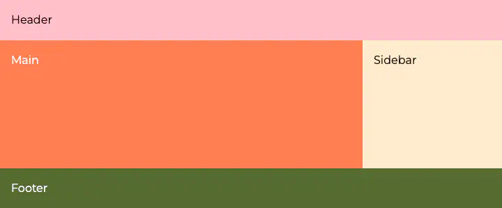
Grid Template Areas is one of the most powerful tools for responsive layouts, allowing you to arrange elements onto a grid in an intuitive manner.
As an example, we might have a layout with a header, main section, sidebar, and footer, which all arrange vertically for narrow viewports. Using grid-template-areas in combination with grid-template-columns and grid-template-rows though, we can rearrange these same elements into a grid pattern with the same markup.
.layout {
  display: grid;
  grid-template-areas:
    "header"
    "main"
    "sidebar"
    "footer";
  grid-template-rows: auto 1fr auto auto;
}

@media (min-width: 768px) {
  .layout {
    grid-template-areas:
      "header header"
      "main sidebar"
      "footer footer";
    grid-template-columns: 1fr 200px;
    grid-template-rows: auto 1fr auto;
  }
}

.header {
  grid-area: header;
}

.main {
  grid-area: main;
}

.sidebar {
  grid-area: sidebar;
}

.footer {
  grid-area: footer;
}
<div class="layout">
  <header class="header">Header</header>
  <main class="main">Main</main>
  <aside class="sidebar">Sidebar</aside>
  <footer class="footer">Footer</footer>
</div>
The above example will produce something like this:
Responsive Images
With high density displays, using an image sized according to CSS pixels rather than device pixels can result in lower quality than a user might expect, and can be especially jarring next to text or vector resources that appear sharp. Therefore, it can make sense to supply users with higher density images.
If it is at all possible, use vector-based images (SVG). Rather than specifying a raster of pixels, vectors describe the process to draw something to a screen, and this process may be scaled up/down to any screen size remaining sharp throughout. Vector images are generally suitable for simple illustrations, icons, or logos. They are not suitable for photographs.
Be aware that SVGs can embed raster images. If this is the case and you can’t source a real vector image, it is better to use a raster image directly. This is because raster images are encoded in SVG using base64 which will inflate file sizes compared with a regular binary file.
For raster images there are a few ways of specifying multiple image sources for high density displays allowing the browser to choose what is best for a given device.
For statically sized images, you can specify an <img> with srcset using x-descriptors (which specify the optimum device pixel ratio). If you have an icon or logo, for example, that displays at 44px wide, you might create a number of different renditions of that image and specify something like:
<img
  srcset="
    /path/to/img-44w.png  1x,
    /path/to/img-66w.png  1.5x,
    /path/to/img-88w.png  2x,
    /path/to/img-132w.png 3x
  "
/>
Importantly, these x-descriptors act only as a hint, and a device may still choose a lower resolution version for a variety of reasons (such as a user opting in to bandwidth-saving provisions).
A similar technique may be employed for background-image using image-set() (note that browser support is patchy) in CSS:
.selector {
  height: 44px;
  width: 44px;
  /* 2x fallback for browsers which do not support image-set() */
  background-image: url(/path/to/img-88w.png);
  /* Safari only supports -webkit-image-set() */
  background-image: -webkit-image-set(
    url(/path/to/img-44w.png) 1x,
    url(/path/to/img-66w.png) 1.5x,
    url(/path/to/img-88w.png) 2x,
    url(/path/to/img-132w.png) 3x
  );
  /* Standard syntax */
  background-image: image-set(
    url(/path/to/img-44w.png) 1x,
    url(/path/to/img-66w.png) 1.5x,
    url(/path/to/img-88w.png) 2x,
    url(/path/to/img-132w.png) 3x
  );
}
For images that change size as the page resizes, a combination of the srcset and sizes attributes may be used. e.g.
<img
  srcset="
    /path/to/img-320w.jpg   320w,
    /path/to/img-480w.jpg   480w,
    /path/to/img-640w.jpg   640w,
    /path/to/img-960w.jpg   960w,
    /path/to/img-1280w.jpg 1280w
  "
  sizes="(min-width: 768px) 480px, 100vw"
/>
In the above example we’re specifying a number of different image renditions in the srcset at various actual widths (320px, 480px, 640px, 960px, 1280px). In the sizes attribute we’re telling the browser that these images will be displayed at 100% of the viewport width by default, and then for viewports at 768px and wider the image will be displayed at a fixed 480 CSS pixels in width. The browser will then pick the optimal image rendition for the device, accounting for device pixel ratio (though again, this is only a hint and the browser may choose to use a higher or lower resolution option).
With modern compression techniques in image formats like WebP and AVIF, it can often be the case that when images are properly optimised for display at 2x density, the file size is only a marginal increase over a 1x version. And, for device pixel ratios greater than 2, there are diminishing returns. For this reason, you can get by only including an optimised 2x image. Jake Archibald, a developer advocate on the Google Chrome team has written a blog article discussing this, highlighting the fact that a majority of your users may be browsing the web with high density displays.